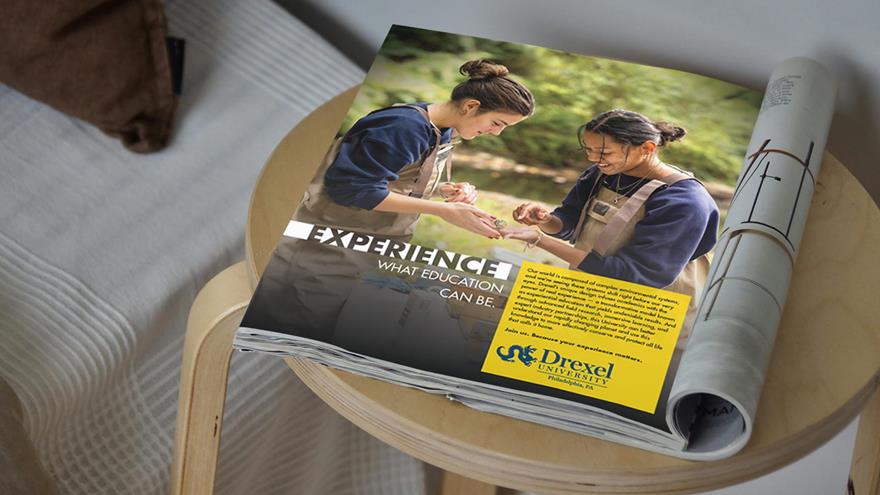
Experience the Campaign

Experience Drexel Environmental Science ad
Get a glimpse of the range of materials we have put into the market around Philadelphia and abroad.

Design Essentials

Get aquatinted with the brand campaign's design toolkit as you integrate subtle touches to it into your work.
This brand campaign design toolkit will help those spreading Drexel's message, such as University communicators, understand how to position our campaign in ways that build understanding of the campaign's unique brand aesthetic and help drive brand recognition and expectations for the campaign across all audiences.

Color Pallette

The Experience campaign often uses our traditional Drexel Gold in a new way to be more attention-grabbing, energetic, and optimistic.
campaign blue

Experience Drexel Blue

CMYK: C100, M63, Y12, K50
RGB: R7 G41 B77
Hex: #07294D

campaign yellow

Experience Drexel Yellow

CMYK: C0, M12, Y98, K0
RGB: R255, G198 B0
Hex: #FFC600

We have purposefully tweaked our traditional Drexel Dragon Blue to be a darker Drexel Campaign Blue. The deep blue connotes security, professionalism, and trustworthiness. The two colors compliment one another and together they convey the spirit of power that comes from real experience.

The campaign also relies on the use of white and black options in situations where color does not integrate well with imagery, or in situations in which we need contrast to emphasize a particular topic or need.

Typefaces

Futura is Drexel University's official sans serif typeface and connects the Experience Drexel campaign with the more prominent Drexel brand.
Experience Drexel Typeface examples Futura

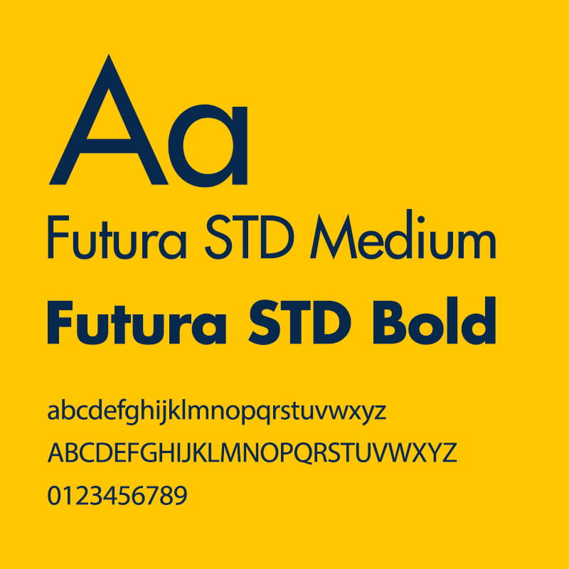
Although Futura offers a wide range of weights, the Experience Drexel campaign sticks with Bold and Medium, only using italic Futura font versions per APA standards (such as recognizing the title of a periodical, book, brochure, or report). Futura also allows for small and digital use without degradation and expresses the Drexel University brand's classic, academic, and collegiate qualities. The Futura Bold font is often used to highlight primary concepts in headlines and to punctuate concluding thoughts in body copy. Futura Medium is used for all supporting body copy, as well as a few minor additional uses.

Ad Text: Futura STD Medium

Ad Headline Text: Futura STD Bold

On limited occasions, the campaign uses Miller Roman, the official Drexel University serif font. We use this font to accent the Drexel University logo with "Philadelphia, PA" or another location, if applicable. Examples of this are in the "Experience Drexel Brand Mark Instructions" below.

Experience Drexel Title Lock-ups

The Experience Drexel title lock-up is an essential ingredient to the visual representation of the Experience Drexel campaign's brand. The continuity of how the mark is used is important so that we can maintain a consistent brand aesthetic reinforcing its intended meaning, ensure that the brand remains memorable, and lay the ground work for audience expectations and brand trustworthiness.
Experience Drexel Logo Lockup example

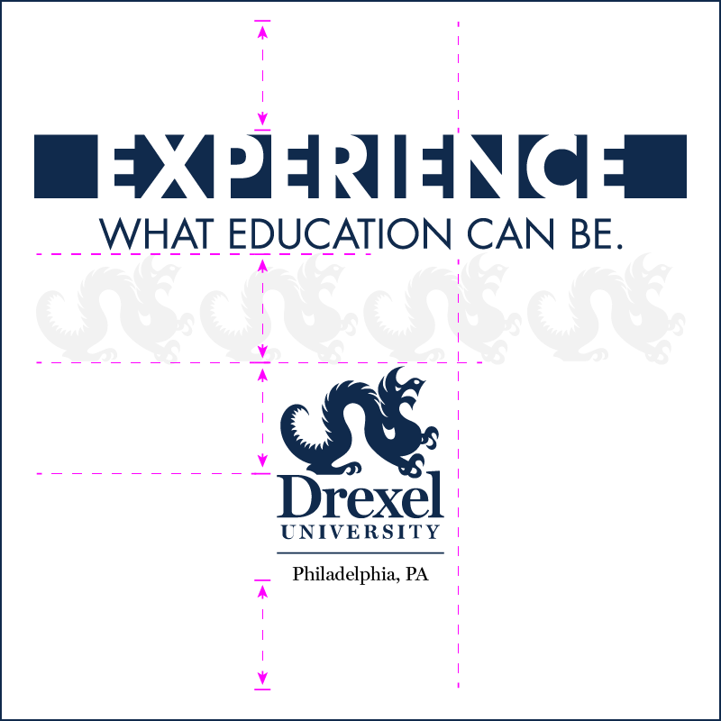
The Experience Title Lock-up Without Additional or Secondary Copy

When using the Experience Drexel title lock-up without secondary copy, the mark should be centered on the printed page or in the digital frame. If room allows, adding the vertical Drexel University logotype, which consists of the University Dragon icon and formal word-mark in a centered configuration, is preferred. This distinct, traditional Drexel logotype should sit centered and below the title lock-up. Using the height of our iconic Drexel Dragon, you can determine the scale relationship between the Drexel University logo and the campaign title lock-up. The Experience title lock-up is about four times the Dragon's width, and you can use the Dragon's height to measure the distance between the campaign title lock-up and the vertical Drexel University logo.

The Experience Drexel title lock-up should never be used without a logo, marker, or written reference to Drexel University. For example, some of our social media visuals use the Experience campaign title lock-up without a Drexel logo, but all social media posts include the Drexel University avatar and the Drexel University name will always title the post. All marketing materials that use the Experience Drexel title lock-up should also include a clear Drexel University name or logo.

Futura's geometric forms pair well with the campaign’s horizontal bar and knocked-out letterforms — this combination helps create the recognizable and memorable Experience Drexel title lock-up.
New York Times ad depicting two Drexel Environmental science students studying a fish outdoors

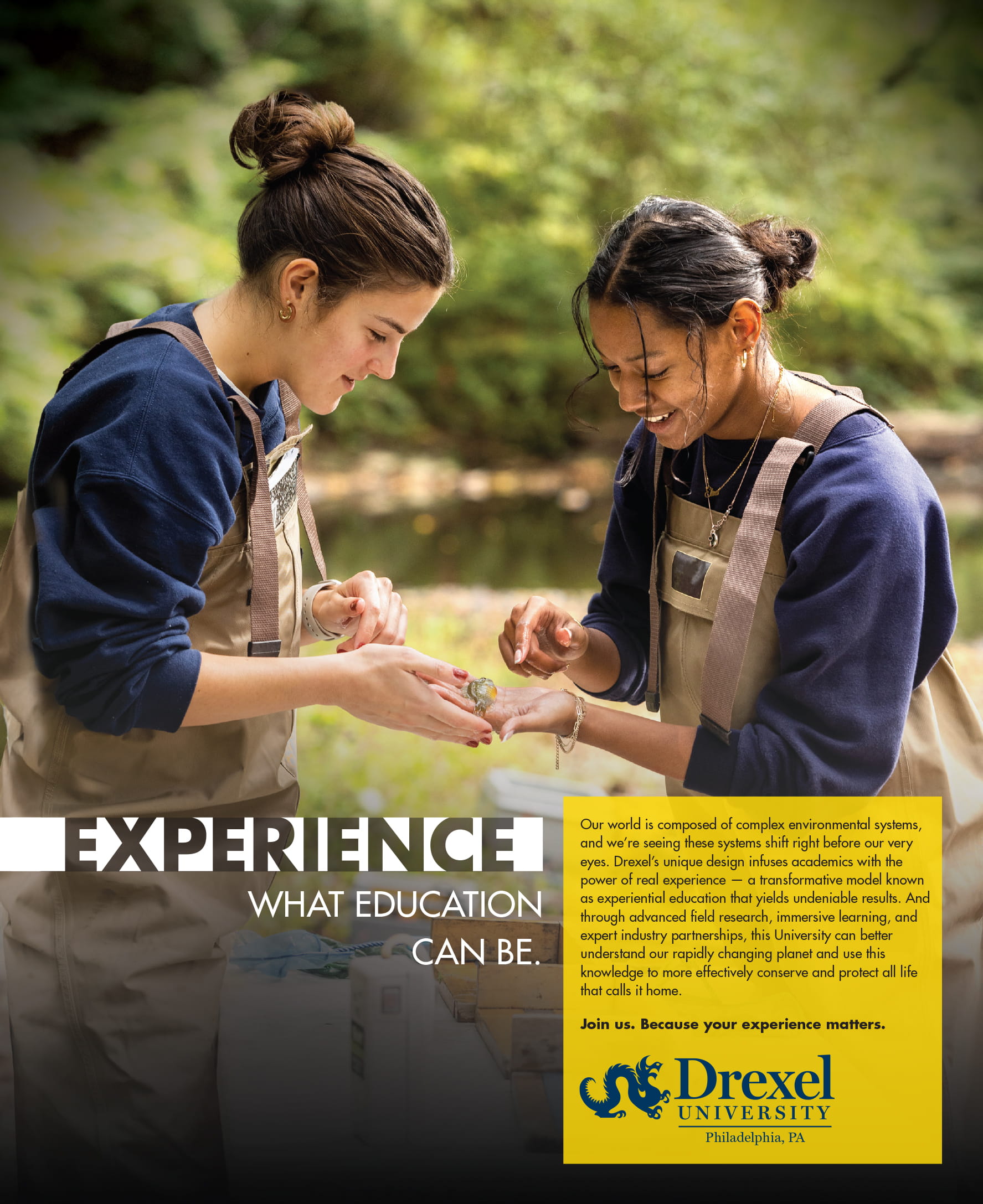
The Experience Title Lock-up With Additional or Secondary Copy

The Experience Drexel title lock-up takes on a right-aligned configuration when using the title lock-up with secondary copy (similar to the image shown to the left). The new arrangement of the Experience campaign title lock-up allows it to flush right, creating an implied line that pairs well with a left-aligned body copy. The body copy, or any additional secondary copy, in this configuration should align with the top of the campaign title lock-up. It is also preferred that the traditional Drexel University horizontal logotype be used below the secondary copy to offset the visual weight of the two marks. This satisfies the requirement that the Experience Drexel title lock-up always be used with a clear logo, marker, or written reference to Drexel University.

General Photography and Video Guidance

Campaign photography and videos rely on a combination of visual cues that convey concepts and craft an overall narrative. For the Experience Drexel brand campaign, these concepts can range from a particular field of study to campus life, partnerships, co-op, and more.

Emotion is one of our key drivers to convey the idea of experience. Therefore, within our photography, our imagery targets one or two individuals as the focal point. There may be more people in the image, but if there is a crowd of people, they tend to be supporting context.

Context or environment is the second key ingredient that helps provide narrative, helps hone in on what the photo is about, and frames the individual's experience. Together, the visual concepts and overall narrative come together to create photos that showcase a specific experience that is often enticing and/or inspiring.

Similarly, our campaign videos should feel inspiring. They should encourage its viewers to feel motivated to not only be an active part of meaningful work, but feel inspired by the idea that they can actually be a part of meaningful work right here at Drexel. This emotional experience is supported by poetic scripts, sweeping visuals, and strong voiceovers. The Experience Education lock-up with the Drexel University logo close out our campaign videos and punctuate its message.

Symbols and Visual Cues for Image Capture

It's essential to be clear on the topic you want the photo to convey. Since the Experience Drexel campaign targets a broad audience that includes everyone from influencers to partners and students to alumni, incorporating prominent symbols or icons related to the topic will be helpful if we are going to speak clearly to everyone. For example, if the topic of the shoot is microbiology, you would want to include visual cues that are very specific to the field and yet recognizable to most people. These visual cues create the context and can drive narrative so that the emotional appeal of the individual(s) can convey the Experience Drexel brand.

Compositional Consideration for Image Capture

Since most Experience Drexel photography portrays emotion using narrative, the following guidelines can assist photographers in capturing this type of emotion. We keep individuals at the focus, in the foreground of compositions. We often crop in on the person to better capture facial and body language, making people larger and the most noticeable aspect of the visual hierarchy. Our subjects can either use direct address or engage with their environment. Symbols or objects directly related to the topic can be positioned in the foreground or midground. The photo's background should preferably offer secondary or tertiary information that directly supports the narrative or topic. If a background is not helpful to the narrative, using a depth of field to create a soft focus on the background can increase the focal point on foreground individuals. In either case, the background should never interfere with the narrative of the photo. It should always increase the impact of the image and its message.