Community Health Profile: Neighborhood Poverty and Health in Philadelphia
Data Brief
May 2017
This brief describes the evolution and spatial distribution of poverty in Philadelphia and illustrates the relation between neighborhood poverty levels and selected health measures. The brief concludes with a discussion of the implications of the findings for actions to improve population health in the city.
Philadelphia is among the poorest large cities in the United States.
In 2015, 26% of the Philadelphia population was below the poverty level. This is nearly twice the US average.
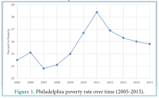
The city poverty rate increased between 2008 and 2011, peaking at 28% in 2011 and slightly declining since then. In 2015, the poverty rate remained higher than the year 2000 rate of 23% and the year 1990 rate of 20%.
Philadelphia is home to large social inequalities that manifest themselves across neighborhoods.
The poverty rate for the city as a whole hides important differences across neighborhoods. Differences across census tracts (geographic areas defined by the US Census composed on average of about 4000 residents) can be used to approximately describe neighborhood differences.
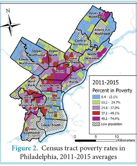
In 2015, the median poverty rate for city census tracts was 25% but poverty rates varied substantially across the city: one fourth of city census tracts had a poverty rate of 37% or more but another one fourth had a poverty rate of 13% or less. One tenth of the census tracts had a poverty rate of 49% or more.
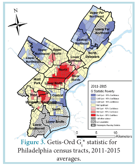
Persons living in poverty tend to live in neighborhoods where others are also poor, and their neighborhoods tend to be surrounded by similarly poor neighborhoods. Clusters of high poverty rates are observed in North and West Philadelphia. Clusters of low poverty rates are observed in Northeast and Northwest Philadelphia and Center City. The Getis-Ord Gi* statistic, a measure of the extent of spatial clustering, shows strong spatial segregation of poverty in Philadelphia.
Blacks and Hispanics tend to live in poorer neighborhoods than whites: in 2011-2015, the average census tract poverty rate was 18% for whites, 31% for Blacks and 36% for Hispanics.
As in other cities, in Philadelphia, persons living in higher poverty neighborhoods tend to have worse health than those living in lower poverty neighborhoods.
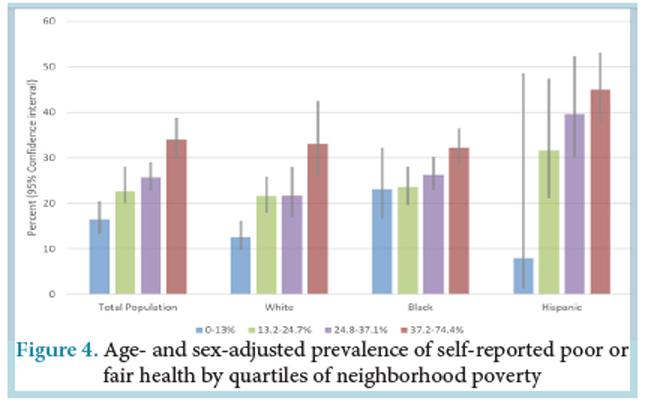
In 2014-2015, the prevalence of self-rated poor or fair health ranged from 14% in the lower poverty census tracts (defined as lowest quartile) to 35% in the higher poverty census tracts (defined as highest quartile).
The relation between higher poverty and worse health was present in whites, Blacks and Hispanics.
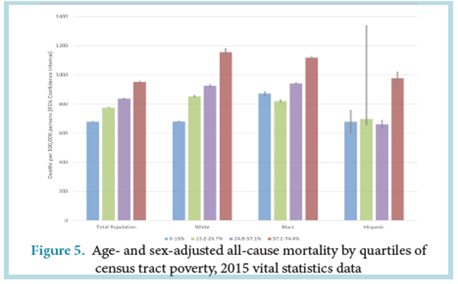
Neighborhood poverty is also strongly related to mortality: in 2015, the lower poverty census tracts had an age- and sex-adjusted mortality of rate of 678 per 100,000 persons compared to a rate of 951 per 100,000 persons in higher poverty tracts.
For all race/ethnic groups, the highest mortality rates were observed in the higher poverty neighborhoods and the lowest were observed in the lower poverty neighborhoods.
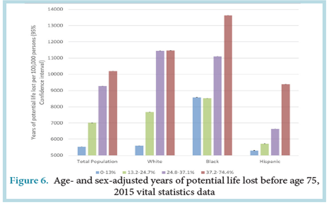
Years of potential life (YPLL) lost before age 75, an indicator of premature mortality, also shows a strong relationship with poverty: persons in higher poverty neighborhoods tend to die at younger ages than those in lower poverty neighborhoods. Analyses of YPLL show that Blacks tend to die at younger ages than white or Hispanic persons whether they lived in higher poverty or lower poverty neighborhoods.
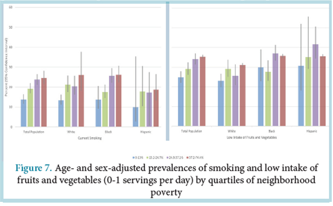
Neighborhood poverty is strongly associated with risk factors for multiple diseases: persons living in higher poverty neighborhoods tend to smoke more, have worse diets, and be more obese.
Smoking is more prevalent in higher poverty than in lower poverty neighborhoods. In 2014-2015, the age- and sex-adjusted prevalence of smoking was almost twice as high in higher poverty than in lower poverty census tracts (25% vs 14%). Residents of high poverty neighborhoods also have poorer diets than those who live in lower poverty neighborhoods. In 2014-2015, 25% of residents in lower poverty census tracts consumed one or less servings of fruits or vegetables per day compared to 35% in higher poverty census tracts.
The relation between higher poverty, more smoking, and poorer diets was present in all race/ethnic groups.
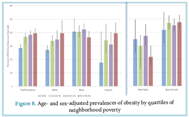
In general, higher poverty neighborhoods have a higher prevalence of obesity. In 2014-2015, the age- and sex-adjusted prevalence of obesity for lower poverty census tracts was 29% compared to 40% in higher poverty census tracts. This pattern was observed for whites and Hispanics. Separate analyses for Black women and white women showed that the relation between higher poverty and more obesity is present in Black women but not in Black men.
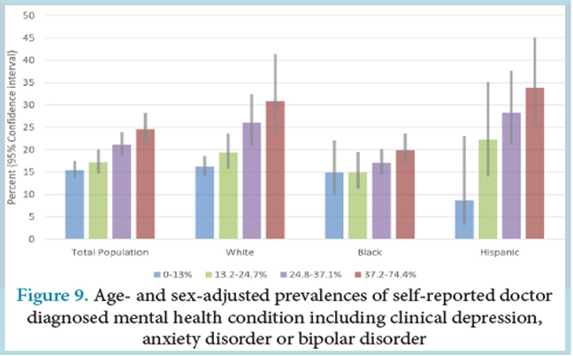
In 2014-2015, the prevalence of self-reported doctor diagnosed mental health disorders was 16% in lower poverty census tracts compared to 25% in higher poverty census tracts. This pattern was present in all races and ethnicities.
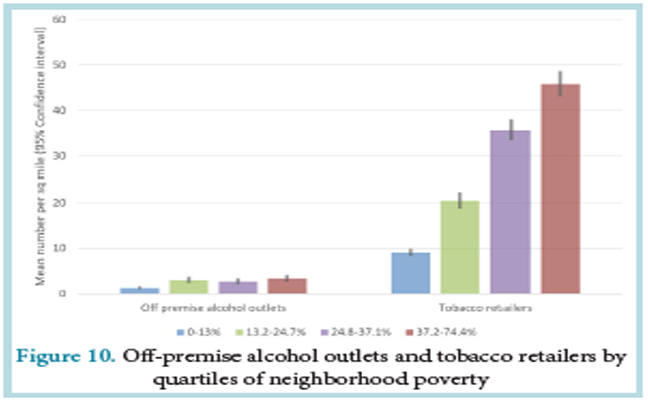
Higher poverty census tracts have more off premise alcohol outlets (outlets that sell alcohol to carry out, see details in Appendix) and more retailers selling tobacco than lower poverty census tracts. In 2015, higher poverty census tracts had 1 off premise alcohol outlet and 9 tobacco retailers per square mile compared to 3 off premise alcohol outlets and 46 tobacco retailers per square mile in higher poverty census tracts.
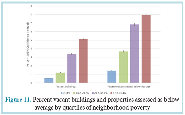
Housing quality also differs across neighborhoods: higher poverty census tracts have more vacant buildings and more properties characterized as below average in exterior condition.
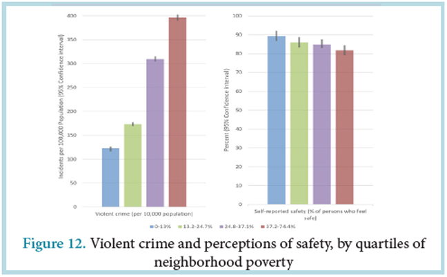
Violent crime is more prevalent in high poverty neighborhoods. In 2015 there were 396 violent incidents per 10,000 persons in higher poverty census tracts compared to 123 incidents per 10,000 persons in lower poverty census tracts. Residents of higher poverty neighborhoods feel less safe than those of lower poverty census tracts.
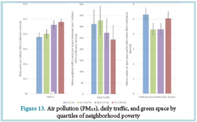
Poorer Philadelphia neighborhoods have higher levels of particulate matter (a marker of air pollution) but less traffic than more affluent neighborhoods. Access to publically available open space is higher in both the highest and lowest poverty neighborhoods, but the quality of these spaces may be very different in high and low poverty neighborhoods.
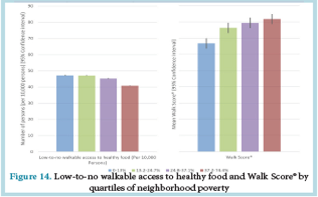
In part, because they tend to be located in areas with greater land use mix and more street connectivity, Philadelphia’s higher poverty neighborhoods have better walkability as measured by Walk Score®, a summary measure of availability of destinations and street network characteristics. Access to healthy foods presents a complex pattern. Because poorer neighborhoods are often more walkable, walkable access to healthy foods is not strongly patterned by neighborhood poverty. However, as previously reported, 1 in 4 Philadelphians live in low-to-no walkable access to health food and high poverty areas.
Conclusions
In Philadelphia, as in many US cities, people living in poverty are highly segregated from those who are more affluent. This results in important differences in poverty rates across the city. A large body of research has shown that higher neighborhood poverty is linked to poorer health across the lifespan.
Many factors contribute to the link between neighborhood poverty and poor health. Residents of poorer neighborhoods may be more likely to be lower income or have less education, and income and education are strong predictors of health.
The concentration of poverty also has consequences for the physical and social environments of neighborhoods. Differences in political power, investment, and services across neighborhoods generate a vicious cycle: segregation results in differences in social and physical environments and these environmental differences reinforce segregation.
Poorer neighborhoods are often less safe and have higher levels of violence. They may have unhealthy physical environments such as higher availability of tobacco and alcohol and higher levels of air pollution. Many poorer neighborhoods have lower access to safe physical activity spaces and to stores that offer nutritious foods, like fresh fruits and vegetables. These characteristics of high poverty neighborhoods can affect health indirectly by making it more difficult to adopt healthy behaviors, or directly by increasing stress levels or increasing exposure to environmental hazards or violence.
There is also variability in environmental features across poor neighborhoods. Not all low-income neighborhoods are the same. Some low-income neighborhoods may have potentially healthy features. For example, in Philadelphia, low-income neighborhoods tend to be more walkable, although the health benefits of greater walkability may be countered by lack of safety or higher levels of air pollution.
Because segregation by race/ethnicity and income are closely linked, Blacks and Hispanics tend to be overrepresented in poor neighborhoods. Thus neighborhood environments may be an important contributor to inequities in health by social class, race or ethnicity.
Together with other research, the findings reported in this brief imply that improving health requires intervening simultaneously on individuals (e.g., through improved health care and health education) and on the contexts in which they live and work (e.g., through community development policies and reduction of occupational hazards)
Policies that improve access to healthy products and reduce access to unhealthy products, enhance access to safe and pleasant spaces for physical activity or socializing, reduce air pollution levels or exposure to environmental hazards, and reduce violence or other neighborhood stressors may have important impacts on health and health inequities.
Neighborhood features may reinforce each other. For example, physical improvements such as revitalized public spaces or blight remediation may reduce violence, which may in turn trigger more physical improvements with health benefits. Community organizing may increase empowerment of residents, which may result in health relevant physical improvements and reduced levels of stress. Thus a range of community development policies may have multiplicative and long term health benefits.
Despite the great promise of neighborhood interventions, there is limited evidence on what policies or interventions are most effective at changing neighborhood environments in ways that improve the health of residents without stimulating displacement and gentrification. Partnerships between policy makers, communities, and health researchers are critical to identifying what strategies work best and how to put them into practice. Integrated inter-sectoral approaches (“health in all policies”) may be especially fruitful.
Limitations
This brief uses census tracts as rough proxies for neighborhoods. Although census tracts are useful in describing spatial differences in poverty they are not always aligned with other definitions of neighborhoods. The health data shown does not capture important areas like child health and infectious diseases. These outcomes have been shown to be strongly linked to poverty in other reports.
Census Data
County level poverty was obtained from the American Community Survey 1–year estimates for years 2005-2015 and from the 1990 and 2000 decennial census.16 Census tract poverty was obtained from the American Community Survey 2011-2015 5-year aggregate data. Poverty is defined as the percent of persons of all ages who are living below the poverty line. A measure of segregation by poverty status was calculated using the Getis-Ord Gi* statistic17. The Gi* statistic gives a Z score for each census tract which indicates the extent to which the poverty in the focal tract and neighboring tracts deviates from the mean poverty of the city of Philadelphia as a whole. Higher positive Gi* scores indicate higher poverty segregation or clustering (Gi*>1.96). Scores near 0 indicate poverty integration. Lower negative scores suggest poverty underrepresentation (Gi*<-1.96). Neighborhoods were defined as tracts that share boundaries (referred to as first order rook or Contiguity – edges only).
Southeastern Pennsylvania Household Health Survey
Self-report measures of health, obesity, smoking, diet, mental health, and safety were obtained from the Southeastern Pennsylvania Household Health Survey (SEPAHHS) administered by the Public Health Management Corporation. SEPAHHS is a landline and cell phone survey of more than 10,000 households in Southeastern Pennsylvania.18 Data included in this report are from the 2014-2015 survey for Philadelphia County.
Self-rated health was categorized as excellent/good vs. fair/poor health. Obesity was defined as body mass index ≥ 30 kg/m2 based on self-reported height and weight. Smoking was defined as persons who reported currently smoking cigarettes. Poor diet was defined as persons who reported eating 0-1 servings of fruits and vegetables per day. Mental health is based on self-reports of having a doctor diagnosed mental health condition, including clinical depression, anxiety disorder, or bipolar disorder. Age- and sex-adjusted prevalence estimates were obtained from Poisson models adjusting to the mean age (53 years) and sex distribution (64% female) of the survey respondents. Safety was assessed using the survey question: “In the past month, did you not go someplace during the day because you felt you would not be safe?” A census tract level measure of safety was derived using empirical Bayes estimation using a random effects model adjusted for age and gender.
Vital Statistics Data
Vital statistics data on deaths for calendar year 2015 was obtained from the Pennsylvania Department of Public Health. Death rates were age and sex adjusted to the overall population distribution for the city of Philadelphia estimated from the American Community Survey 2011-2015 using the direct standardization method and 9 age categories. Rates are expressed in number of deaths per 100,000 population. Year of potential life lost (YPLL) before a given age can be used to assess premature mortality. We used YPLL at age 75 which sums the total years of life lost for death prior to age 75. YPLL-75 was age and sex adjusted to the overall population distribution for the city of Philadelphia estimated from the American Community Survey 2011-2015 and is expressed as the number of years of life lost per 100,000 population.
Alcohol Outlets
Alcohol outlet data came from the Pennsylvania Liquor Control Board (PLCB) and represent all alcohol licenses as of May 2016. Alcohol outlets displayed in this report include only off-premise alcohol outlets. These included state-controlled liquor stores and PLCB Licenses ‘E’ (Eating place retail dispenser) and ‘D’ (Distributor). As of May 2016, state-controlled stores were the only retailers permitted to sell wine and liquor for off-premise use. E licenses were permitted to sell beer (192 fluid oz or less) for off-premise use but must be equipped to sell food (these were mostly delis and corner stores where purchases were more likely to be consumed off-premise). D licenses were permitted to sell beer (264 fluid oz or more) for strictly off-premise consumption. Off-premise outlets are shown because adverse effects such as violence have been linked to off-premise alcohol outlets more than to on-premise establishments (bars and restaurants). On-premise establishments may exert stronger social control on the local environment via bouncers and other staff. Alcohol outlet densities were calculated per square mile within a census tract.
Limitations of alcohol outlet data.
While wine and liquor for off-premise consumption can only be purchased at a state-controlled liquor stores, the delineation for sales of beer is less clear. PLCB also issues ‘R’ licenses (Restaurant Liquor) which includes more traditional restaurants and bars where on premise consumption of liquor, wine, and beer is permitted. These licenses also allow (but do not require), off-premise sales of beer (192 fluid oz or less). Unfortunately, available data do not allow distinguishing R licensed establishments that sell beer for off premise consumption from those that do not. Therefore R licenses are not included as off-premise consumption outlets in our analyses. This is imperfect but was judged preferable to the larger measurement error introduced by including large numbers of R establishments (mostly restaurants) that sell primarily for on-premise consumption).
Tobacco Retailers
Tobacco retailer data came from the Philadelphia Department of Public Health and are current as of December 31, 2015. These are stores licensed to sell tobacco within the city of Philadelphia. Tobacco retailer densities were calculated per square mile within a census tract.
Vacant Buildings
In 2016, the Philadelphia Office of Innovation and Technology released on www.OpenDataPhilly.org data that identifies properties likely to be vacant or to have a vacant building. The probability that a parcel was vacant was estimated by the City of Philadelphia Office of Innovation and Technology in cooperation with Department of Licenses and Inspections (L+I), Office of Property Assessment, Philadelphia Land Bank and Philadelphia Water Department using an analytical model that incorporates information from multiple sources for each tax parcel boundary in the city. This data was then used to estimate the percent of residential parcels in each census tract likely to contain vacant buildings. Commercial, industrial and other non-residential land uses were excluded. Land uses were identified from the 2014 parcel land use data from the Philadelphia City Planning Commission (www.opendataphilly.org access date 9/13/2016).
Property Assessments
Property characteristics and assessment information from the Philadelphia Office of Property Assessment as of 7/19/2016 were downloaded from opendataphilly.org. The measure of exterior conditions is based on observation and comparisons to surrounding properties in the geographical marketing area. Below average properties have excessive deferred maintenance, wear and tear, abuse, and/or minor vandalism, or unrepaired minor fire damage.
Crime Data
Crime data came from the City of Philadelphia Police Department (available from OpenDataPhilly) for the calendar year of 2015. Violent crimes were defined as aggravated assault with and without firearm, robbery with and without firearm, rape, homicide, and other assaults (primarily simple assault and battery). Rates per tract per 10,000 resident population were estimated using ACS 2011-2015 denominator data. Violent crimes were selected because there was better/uniform reporting and indication of serious crimes. Data were downloaded from OpenDataPhilly in July 2016; the web data file date was the date of download (data are updated daily).
Limitations in classification of violent crimes. Violent crime was defined by grouping the following categories: homicide (criminal and gross negligence); aggravated assault (with and without firearm); other assaults (simple and minor assaults and battery); robbery (with and without firearm), and rape. In the dataset available, other assaults also included relatively low-frequency incidents: injury by culpable negligence; resisting or obstructing an officer; and stalking, intimidation, coercion, and hazing. We are unable to separate these incidents from the more serious bodily assaults, but given the low frequency of these, it is anticipated they would not exert a large impact on results. Sensitivity analyses excluding all other assaults yield similar results to those shown.
Air Pollution
2012 annual average of tract daily PM2.5 estimates were calculated from the Fused Air Quality Surface Using Downscaling Model output downloaded from https:// www.epa.gov/hesc/rsig-related-downloadable-data-files (access date 10/27/2016).
Traffic
Measured and estimated traffic volumes for major roads by section of road from PennDOT for 2016 were downloaded from www.pasda.psu.edu (access date 4/26/2017). Average daily traffic was weighted by the length of roads that pass through a neighborhood by
multiplying the vehicles per day of daily traffic by the length of road in meters. This was then divided by the land area of the census tract to derive an estimate per square kilometer. To simplify presentation, this estimate was then scaled by dividing by 1 million. Roads within 400 m of 2010 census tract boundaries were included in the calculation because census tract boundaries are often major roads and 400 m is a reasonable estimate of the distance within which traffic may impact air pollution levels.
Open Spaces
2016 Philadelphia Parks and Recreation Park Boundaries downloaded from www.opendataphilly.org (access date 4/21/2017) were used to identify publicly accessible open space. Walkable access was defined as within ½ a mile (approximately 800 m). The count of publicly accessible open spaces within 800 meters of 2010 census tract centroids was calculated for each tract.
Walkable Access to Healthy Food
2010 Census Blocks classified as no, low, moderate or high walkable access to healthy food were downloaded from www.opendataphilly.org (access date 8/12/2016). The Philadelphia Department of Public Health’s created the dataset through the following process:
1.) Collect food retailer locations and data fromvarious sources including Nielsen-Trade Dimensions, Get Healthy Philly, Environmental Health Services, and retailer websites.
2.) Establish a scoring system for retailers reflecting the relative availability and quantity of healthy foods for sale by retailer type.
3.) Determine a service area within which people would walk to shop at these retailers.
4.) Create spatial walksheds reflecting these scores and service areas.
5.) Calculate food access scores for each city block in raster format using map algebra and zonal statistics.
6.) Categorize citywide food access scores into meaningful categories.
7.) Spatially identify blocks with low to no access to healthy foods and high poverty.
The Urban Health Collaborative used 2010 census block populations from the U.S. Census Bureau to create tract level measures from the block level data. For each census tract, the number of persons in blocks categorized as low or no access to healthy food were summed together and divided by the total population in the tract to obtain a percent of persons with low-to-no access.
Walk Score
Walk Score® is a measure of “walkability” created by Walk Score® Research Services (http://www.walkscore.com/) a part of Redfin Corporation (https://www.redfin.com/). Walk Score® characterizes the walkability of a given address. For each address, the Walk Score® method analyzes hundreds of walking routes to nearby amenities. Points are awarded based on the distance to amenities in each category. Amenities within a 5 minute walk (0.25 miles) are given maximum points. A decay function is used to give points to more distant amenities, with no points given after a 30 minute walk. Walk Score® also measures pedestrian friendliness by analyzing population density and road metrics such as block length and intersection density. Data sources include Google, Education.com, Open Street Map, the U.S. Census, Localeze, and places added by the Walk Score® user community.
For 2010 census tracts smaller than 2.25 sq km, Walk Score® values were obtained for one point near the tract centroid. For larger census tracts Walk Score® values were obtained for a minimum of two points with up to 1 point per 2.25 sq km. Points were randomly selected with a minimum distance of 300 m between points. Points were located on non-highway streets. Inverse distance weighting was used to convert the Walk Score® estimates for these points to a 150 m resolution surface. Census tracts were divided into 150 m cells and the average estimated Walk Score® for the cells that correspond to each census tract was calculated.
CITATION
Diez Roux AV, Moore KA, Melly SJ, Wang X, Joshi R. Neighborhood Health and Poverty in Philadelphia. Urban Collaborative Data Brief Number 2, 2017. Dornsife School of Public Health, Drexel University: Philadelphia PA.